Designing for Stranded Knitting
Tricot / Knitting
It is exciting to design color patterns for stranded knitting. Often they’re just geometric designs (and not pictorial representations of real things), so there’s no need to worry about getting anything “right.” Really, no art degree is required.
I’ve included a treasury of patterns that you can color and use for your knitting. Cross-stitch and needlepoint charts are also great sources for stranded-knitting charts, since their square grids match the gauge of stranded fabrics.
I hope you’ll take my lead and have fun creating new patterns to knit. Since stitches are square in shape when knitted using stranded-knitting technique, you can use regular square graph paper when designing stranded patterns. (There can never be too many designers out there!)
Pattern Categories
Traditional stranded Fair Isle designs use the following kinds of patterns.
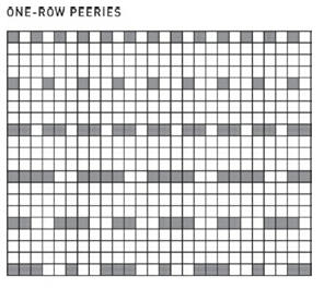
• Peerie patterns are small one- to seven-row patterns that are often interjected between larger patterns. They can be worked with contrasting background colors for extra color and impact.
• Horizontal borders are large patterns, usually seven or more rows high. They are often based on traditional X-O-X patterns to eliminate long floats on the wrong side of the fabric. Two Xs next to each other would create super long floats in the middle of the pattern; two adjacent Os would have two sloppy floats (one at the top and one at the bottom). An X-O-X arrangement deals with this issue neatly—and beautifully.

• Seeding patterns are tiny all over patterns that are perfect for areas where shaping is going to occur and where more complicated patterning will become obscure—and difficult to knit.

• All over patterns are repeated horizontally and vertically throughout a fabric. These patterns have no solid-colored rows or rounds. See the Fleur de Lis Jacket for a knitted example.
Pattern Placement
• When working in the round, try to adjust your stitch count so it is an exact multiple of the number of stitches called for in your color pattern. Or, work several stitches at the sides in a contrasting seeding pattern, centering your main pattern between them.
• To ensure that your pattern matches up neatly at the shoulders when knitting in the round, it is critical that an even number of repeats of the largest pattern repeat is used.
• Try to plan that your shoulders end in the middle of a large border pattern rather than near the end of one. This way, once the shoulders are seamed, the join will be more harmonious with the rest of the garment.
• To knit a cuff-to-cuff sweater, use a steek for the lower edge of the garment. Once you cut your steek, just pick up and knit your ribbed band.
• For visual interest, alternate wide and narrow bands of patterns, as in David’s Favorite Fair Isle V-Neck.
• For children’s garments, use isolated bands of patterns along the lower edge or near the top of the garment. All over patterning can overwhelm small bodies.
Color Placement within Patterns
• To start, keep one color consistent throughout a project—the background, perhaps— and change the contrast color every few rows. You’ll still get complexity of pattern and lots of eye movement without much design stress.
• When changing colors within a border pattern, keep in mind that in order for the pattern to “pop,” there must be enough contrast at the top and bottom of the border. For example, the charts above are identical in pattern, but the color placement is different in each one. Of the topmost charts, the left chart is more successful because the yellow patterning on the upper and lower edges of the chart spring off the page. Interestingly, when these two charts are worked on a light background, the opposite is true, since the red color toward the outer edges of the border “pop” more than the yellow.
• Want to add some complexity without much work? Use a variegated or hand-painted yarn as either the background or patterning color. Be certain that all hues within the color way contrast sharply with the other color you’re using or else sections of your pattern will be lost!

The placement of colors in a pattern affects the overall success of the design.
Top Left: When placed toward the outside of the design, the color yellow contrasts well with the purple background.
Top Right: Placing yellow at the center of the design is less successful.
The opposite is true with a white background.
Bottom Left: Here, the color red seems clunky and heavy at the center of the design.
Bottom Right: When moved to the outside of the pattern, the red pops out from the white background, making for a more successful design.
color PLAY
Try rotating one of the horizontal borders to create a vertical design element!

![]()